A chart is one of the most important tools in your trading toolbox.
To have a clear understanding of technical analysis you’re going to need handful of tools.
To have a clear understanding of technical analysis you’re going to need handful of tools.
I’ve been a student and a user of technical analysis for decades. I earned my Chartered Market Technician certification in 2015. I’ve studied thousands upon thousands of charts and hundreds of different chart/indicator combinations. Here’s my main take away.
Stock charts don’t need to be complicated
Stock charts can be complicated and intimidating but they don’t need tons of fancy indicators to be useful. That’s why I want to point out two simple chart features that will help you identify opportunities without being unnecessarily complicated.
With an understanding of these tools you will have the beginnings of a solid knowledge base for chart reading.
Candlestick charts tell you basic price action
You have to see the price action first.
Whether you’re looking at weekly, daily, or intraday charts, candlesticks show a concise picture of the price action. The construction is very simple. Candles consist of a “body” and “wicks.” The body shows the opening and closing prices. Wicks show the high and low for the time period. If the closing price is higher than the opening price then the candle will be green. And if the opposite is true it will be red. So in an instant you can see all of that data and get a clear picture of price direction. Then you can see the sequence of candles for the time frame and start to get an idea whether price is trending or not.
Moving averages smooth price data and confirm trends
Add moving averages to your charts to smooth data and confirm price trends.
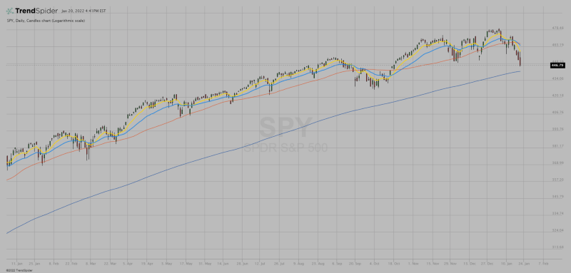
Smoothing the price data makes it easier to visualize trends and momentum. I use four primary moving average periods for this; 8, 21, 50, and 200. When price is above all four of those averages, and the averages are all sloping upward, that confirms that the price is in an uptrend. And if the space between the moving averages is increasing then there is momentum with the trend. Once again, with these tools all of that data can be identified in an instant.
These tools are incredibly useful and wildly popular. There is an endless amount of explanation available to gain a more technical understanding. And if that’s your thing, go for it. But remember, the idea here is to keep is simple. So start with the basics. Make sure you understand what you’re seeing. Master these tools first. Then look deeper if you need.
See a candlestick chart of SPY here. The 8, 21, 50, and 200 moving averages are show in yellow, light blue, red, and dark blue.
SPY,Daily Candlestick chart published by Andrew Moss
SPDR S&P 500 Candlestick chart created with TrendSpidershare.trendspider.com
This post was created with Typeshare


