Chart School
Basic Elements of Stock Charts And Indicators
Special Announcement!
The Trading Adventures YouTube Channel is here!
Watch now as I take you through the charts and indicators, explaining each in this simple, easy-to-follow conversation.
Tip: Double-click to watch full screen - and make sure it’s in HD
Hit the Subscribe button while you are there.
More videos will be coming quickly as we:
Go deeper into each one of the subjects covered in this article
Share more lessons on charting, trading, and market analysis
Analyze and review recent market action
Make plans for what is coming next
Thank you all! I hope you enjoy it.
I look at a lot of charts. I post and share many of those charts online. Most who take the time to look probably have a basic understanding.
But,
It never hurt to be sure
Periodic review is good
Context helps
So, let’s look at how I build a chart, what indicators I use, and how I read them.
Candles
Volume
RSI
Moving Averages
Bollinger Bands
Anchored Volume Weighted Moving Average (AVWAP)
Pivot Levels, Trendlines, Support & Resistance
Click on any chart for a full-screen view
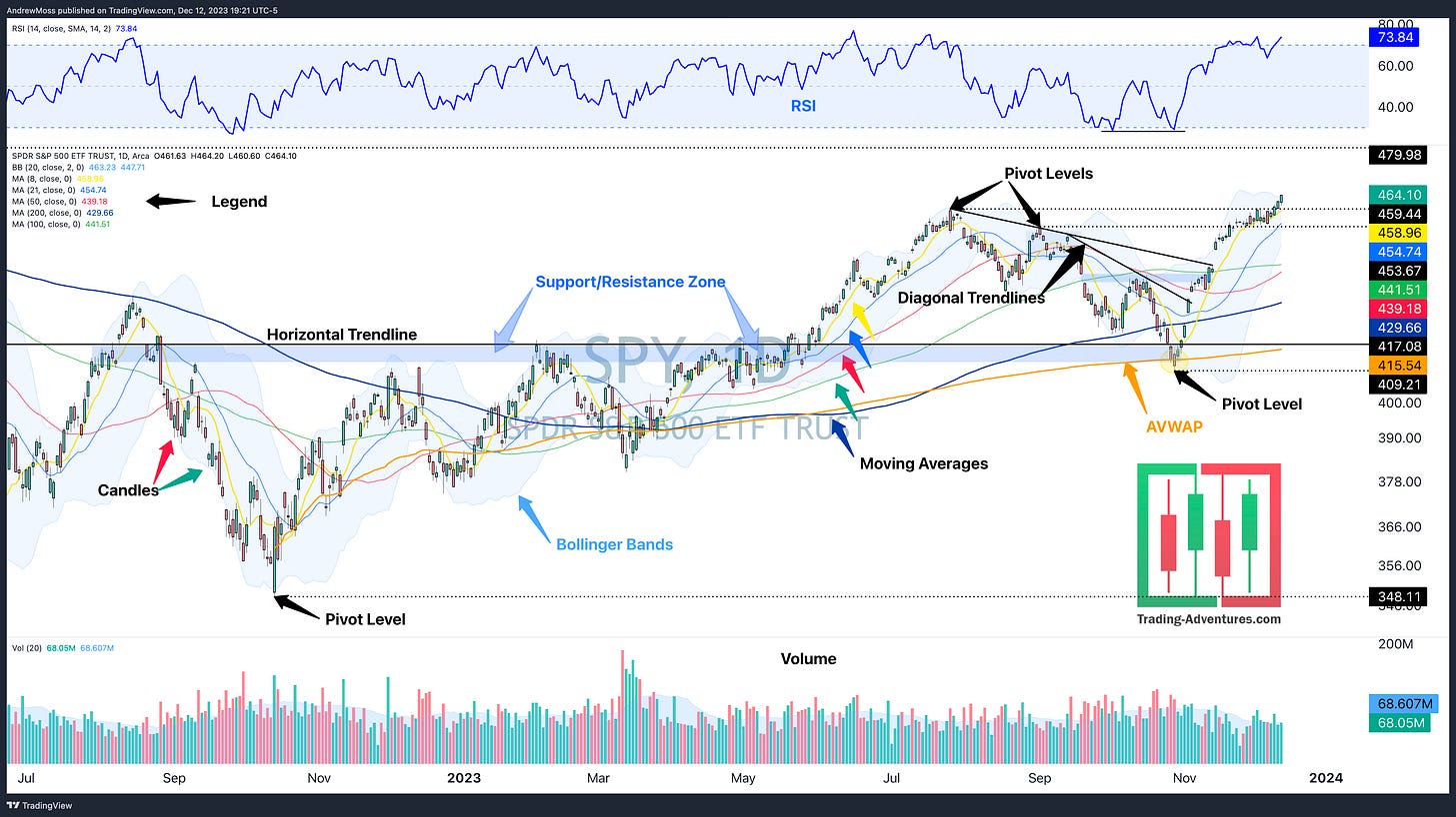
SPY Daily Chart
Keep It Simple
Stock charts don’t need to be complicated.
Tons of fancy lines and indicators may look good. But it's no guarantee that more useful info will jump out. Too many squiggly lines on a chart often lead to contradiction and confusion.
Here are some basic chart features that will help you identify opportunities without being unnecessarily complicated.
Candles
What are they?
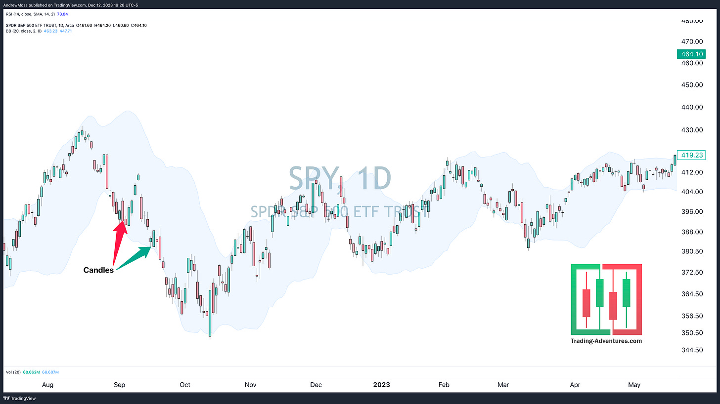
Candlestick charts show a concise picture of the price action on any timeframe.
Each candle consists of four main components.
Open, High, Low, Close (OHLC)
When a candle closes the day higher than the open, a green (or white) candle is formed. When the daily closing price is lower than the opening price, the candle is red (or black).
What To Look For
Which way is price trending?
Or is it rangebound and choppy?
Are there more red or green candles?
Are they big or small?
Read this article for more on candlestick charts.
Volume
What Is It
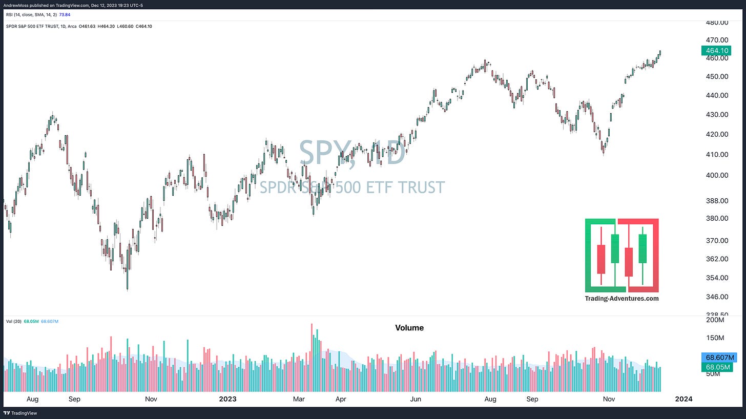
Volume is the number of shares traded for a given period.
What To Look For
is volume increasing or decreasing
is it above or below average
is there a sudden spike
Volume adds a useful layer to price analysis. For instance, a significant increase in the number of shares traded right when the price breaks out of a pattern adds conviction to the move.
Relative Strength Index (RSI)
What Is It
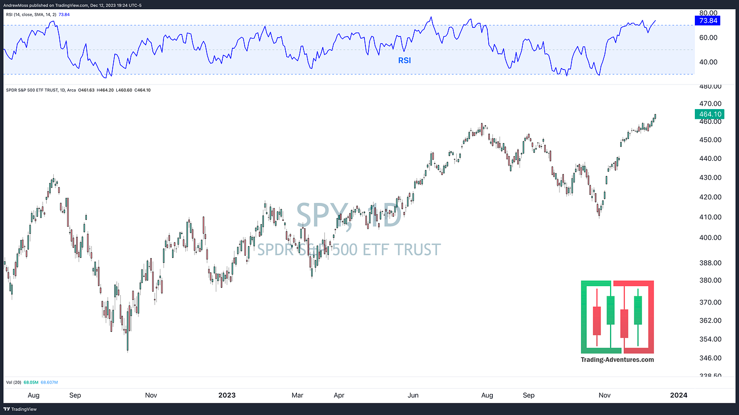
RSI is a momentum oscillator. The calculation results range from 0 to 100.
What To Look For
Is it above 70 - overbought or below 30 - oversold?
Is there a divergence from price?
These conditions can be a precursor to reversal.
Does it spend more time above or below 50%?
Stocks in healthy uptrends usually have an RSI that remains above the 50% level.
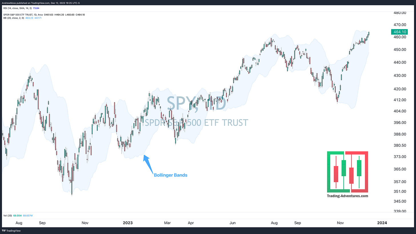
Bollinger Bands
John Bollinger developed these bands to establish a bell curve or a normal distribution for prices. Based on a moving average midline (usually 20 periods), the calculation then adds an upper and lower band, each one being one standard deviation away from the midline.
What To Look For
Are the bands wide or narrow?
An indication of volatility
Is there a ‘squeeze?’
Narrowing volatility followed by abrupt expansion often leads to opportunity.
Are they sloping?
Where is the price relative to the bands?
Near the upper band and pushing it higher? This can be an indication of a strong uptrend.
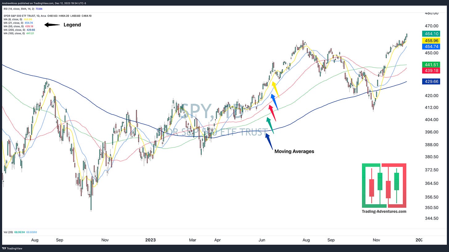
Moving Averages
What Is It
Moving averages smooth out price data, confirm trends, and make them easy to identify.
On a daily chart, I use five moving average periods —
8 (yellow)
21 (light blue)
50 (red)
100 (green)
200 (dark blue)
Weekly charts have a 10-week (Red), which is the same as the 50-day, and a 40-week (dark blue), the same as the 200-day.
On a 30-minute chart, I have only a 5-day moving average and a week-to-date anchored VWAP—more on AVWAP in the next section.
What To Look For
Is the price above or below
When price is above the moving averages and all are sloping upward, that confirms an uptrend.
Is the price close to or far away from the average?
If the price is far above a rising 8-day MA, that signals extension and could mean a correction is due.
Are the moving averages close together or far apart?
If the space between the moving averages is increasing, then there is momentum with the trend.
If it is decreasing, then the trend could be losing strength.
Are they all sloping in the same direction?
When they move together, there is time frame continuity, adding strength and validity to the trend.
When the averages are converging or in conflict, it can mean prices are rangebound.
There could be a short timeframe uptrend within a larger timeframe downtrend, also known as a countertrend move.
Sometimes, hiding the price candles and looking at the MAs alone is helpful. This shows an even clearer picture of the overall trend by eliminating the noise of the day-to-day action.
Anchored Volume Weighted Average Price (AVWAP)
What Is It
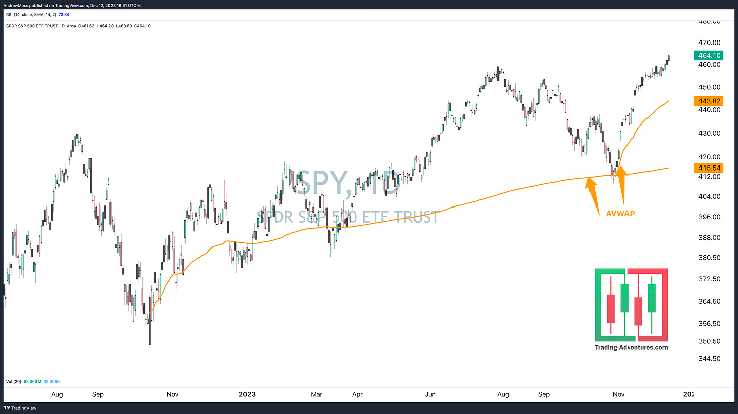
VWAP is the stock's average price for a specific time frame, weighted by the number of shares traded at each price. Traditionally, this was an intraday calculation, starting with the first trade of the session, ending with the last, and resetting every day.
Anchoring the VWAP to different events and points in time has become a valuable tool for me. Anchors are usually set at special events such as an earnings report, a price gap, a recent pivot high or low, etc. I am consistently amazed at the turns and reversals that show up at various AVWAPs.
Brian Shannon has taught me everything I know about this indicator. He has been a pioneer and advocate of AVWAP and has written a book about it. I encourage anyone interested in learning more to visit his website and read Maximum Trading Gains With Anchored VWAP.
What To Look For
Similar to the Moving Averages above
Is it sloping?
Is the price above or below?
Have there been reversals?
This shows whether a particular AVWAP has provided price support or resistance. Sometimes it does. Sometimes it does not.
“True Support or Resistance cannot be known until after the fact,” — Brian Shannon.
Pivot Levels, Trendlines, Support & Resistance
What Is It
Price has memory.
It is common to see particular price levels act as support or resistance. This can result in a price pivot — a sharp reversal. These are worth watching as there are endless examples of prices traveling back to a previous pivot only to reverse again.
When considering order flow, it makes perfect sense.
If a trader or investor has a position to sell, they may only be willing to do so at a certain price or higher. So when the price comes up, they enter their sell orders, and if their supply overwhelms demand, the price reverses and moves lower.
The opposite is true for a buyer looking to establish or increase a position.
This action doesn’t always result in a pivot. Sometimes, it is a floor or a ceiling — support or resistance — that can last for an extended period of time. This can be signified by drawing a trendline.
Horizontal trendlines carry more significance due to having less subjectivity. However, angled trendlines can be helpful as well. Just beware that drawing lines on a chart is not an exact science. Lines thought to carry great importance can often have no significance whatsoever.
What To Look For
Pivot levels — Dotted lines extending to the right
Pivot points on my charts are notated with dotted lines, called horizontal rays, in the charting software. The main reason I add these is for the price label.
Pivots are easy enough to spot on the chart. Adding the label helps quickly identify the high or low price at which the pivot occurred.
Trendlines — Solid lines connecting at least two price points
As mentioned previously, these can be horizontal or at an angle. Sometimes, trendlines will work together to designate a pattern. Again, drawing patterns can be very subjective and, therefore, unreliable.
The price points don’t have to be precise, either. Often, support or resistance shows up in an area rather than a specific price.
In this case, I will draw a rectangle (basically a thick line). The shaded area is referred to as a support or resistance ‘zone.’
Conclusion
Candles
Volume
RSI
Moving Averages
Bollinger Bands
Anchored Volume Weighted Moving Average (AVWAP)
Pivot Levels, Trendlines, Support & Resistance
That is what you will find on 90% of the charts I share.
Now, you will better understand the mindset and thought patterns when you see them in articles here or on X/Twitter.
I generally seek to keep it very simple. And as much as I like viewing indicators, pivots, and trendlines, I like removing them even more. A crowded, complicated chart can be a liability more than anything.
Other popular indicators include MACD, Williams %, On Balance Volume, etc. I have nothing against any of those. I just haven’t found that they fit well with my trading style.
I do occasionally add Fibonacci levels, DeMark indicators, and others. These can be complicated, though, so I use them sparingly.
Experiment with your charts. Add these tools and any others you find interesting. And learn more about them as you do.
But don’t forget to take some away too. After all, price is the main focus. And each of these indicators is simply a derivative of the price.
To help:
More videos on each of these topics are coming soon
Send me your questions by commenting, replying to email, hitting the Contact Me button, on X/Twitter, etc. I’m here to help.
Visit the CMT Association directly at CMTAssociation.org
Good luck and good trading.
The Disclosures
***This is NOT financial advice. NOT a recommendation to buy, sell, or trade any security. The content presented here is intended for educational purposes only.
Andrew Moss is an associated member of T3 Trading Group, LLC (“T3TG”) a SEC registered broker/dealer and member of FINRA/SIPC. All trades placed by Mr. Moss are done through T3TG.
Statements in this article represent the opinions of that person only and do not necessarily reflect the opinions of T3TG or any other person associated with T3TG.
It is possible that Mr. Moss may hold an investment position (or may be contemplating holding an investment position) that is inconsistent with the information provided or the opinion being expressed. This may reflect the financial or other circumstances of the individual or it may reflect some other consideration. Readers of this article should take this into account when evaluating the information provided or the opinions being expressed.
All investments are subject to the risk of loss, which you should consider in making any investment decisions. Readers of this article should consult with their financial advisors, attorneys, accountants, or other qualified investors prior to making any investment decision.
POSITION DISCLOSURE
December 20, 2023, 4:00 PM
Long: ADBE, AMZN, IWM, NVDA, QQQ, TSLA, XBI0119C90
Short:
Options symbols are denoted as follows:
Ticker, Date, Call/Put, Strike Price
Example: VXX1218C30 = VXX 12/18 Call with a $30 strike





HOLY SHIT! THIS IS GOLD!!!!!