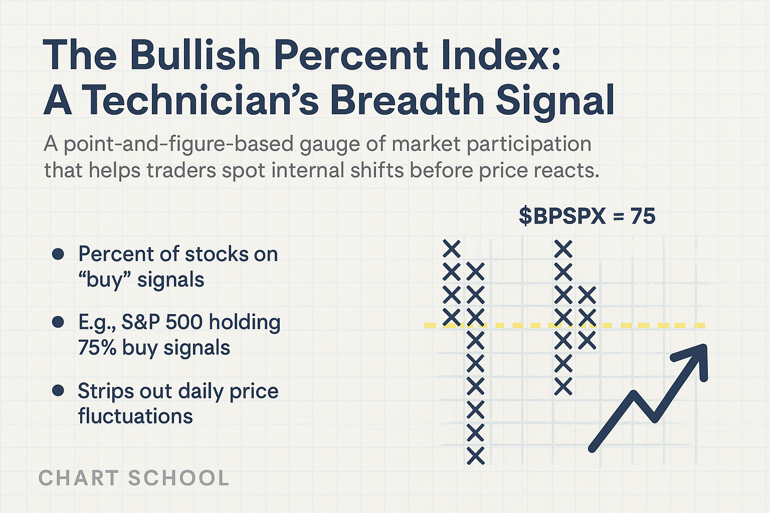
The Bullish Percent Index: A Technician’s Breadth Signal
A point-and-figure-based gauge of market participation that helps traders spot internal shifts before price reacts.


Understanding the Bullish Percent Index (BPI)
The Bullish Percent Index (BPI) is one of the most powerful tools for understanding market breadth—especially when used through the lens of Point & Figure charting. It helps traders gauge participation, manage risk, and spot internal shifts that often lead price action.
This breakdown covers what BPI is, how to use it effectively, and how to avoid common misinterpretations.
Point & Figure Roots
My introduction to technical analysis began decades ago, flipping through the old Chartcraft Point & Figure books—black-and-white tables filled with columns of Xs and Os.
These books, originally authored by A.W. Cohen in the 1940s, helped codify the three-box reversal method and high/low plotting techniques that form the core of P&F analysis today.
While I wasn’t reading them in Cohen’s original era, those same foundational tools helped me learn to read markets through the lens of price, supply, and demand—long before candlesticks or moving averages were my focus.
What Is the Bullish Percent Index?
The BPI measures the percentage of stocks in a group (e.g., S&P 500) that are currently on Point & Figure buy signals—defined as a higher high within a column of Xs.
BPI = (Number of Stocks on P&F Buy Signals ÷ Total Stocks) × 100
It’s a “one-stock, one-vote” approach, stripping out weighting distortions and showing true participation.
Example: If 75% of stocks in the S&P 500 have active P&F buy signals, $BPSPX = 75.
🔗 Dorsey Wright Point & Figure University
How to Interpret BPI
1. It’s a Risk Gauge, Not a Timing Tool
BPI doesn’t predict direction—it helps you determine whether the market is playing offense or defense.
Rising BPI = more stocks generating buy signals → offense is on the field
Falling BPI = buy signals are breaking down → defense is taking over
This shift in tone helps you decide whether to press or protect.
2. Key Zones to Watch
Above 70–80% → Overbought, but confirms a strong trend
Below 30–40% → Oversold, potential washout or base-building zone
Direction > Level — Reversals tell you more than static values
3. Signal Mechanics
A column reversal (Xs → Os) = Bearish shift
A break below 70 after a peak = Early risk-off cue
Divergence from price = Internals weakening beneath the surface

Practical Uses
Risk Management
Tighten stops or scale back when BPI reverses from high levels.
Price Confirmation
Price rising while BPI falls = Internal weakness
Price falling while BPI rises = Hidden strength
Sector/Index Comparison
Compare $BPSPX, $BPNDX, $BPNYA, or look at individual market sectors.
Note if and where rotation or breakdowns are starting.
Use in Confluence
Pair with:
RSI or MACD for momentum
% of stocks above key MAs (Like this one! In every 📈Weekly Charts📉 analysis)
Moving averages or price trend structure
Want alerts that align with this kind of tactical analysis?
Get the setups, levels, and exits we’re watching—delivered in real time.
Common Mistakes to Avoid
Overbought ≠ Sell: A high BPI reflects strength until a clear reversal occurs.
Static levels can be misleading: Direction, reversals, and divergence are what matter most.
Never use in isolation: Context is everything. Combine with trend, momentum, and price.
Why It Still Matters
Tom Dorsey took the foundational work of A.W. Cohen and turned the BPI into a modern, institutional-grade decision tool. It’s been a core part of the Dorsey Wright system ever since—and it remains just as useful today.
It won’t tell you exactly when to buy or sell.
But it will tell you how much risk is in the market—and that can make all the difference.
Final Takeaway
Bullish Percent Index = A measure of participation and risk
Use it to contextualize price, not replace it
Watch for reversals from extremes, especially if unsupported by price
Pair it with other tools for better decisions under pressure
Want more Chart School breakdowns like this? Let me know which indicators you’d like to see next.
Appreciate this kind of technician-grade insight?
Chart School is built for traders who care about structure, participation, and timeless tools like Point & Figure.
There are no paywalls—just a “pay-if-you-want” option to support the work.
If these deep dives are helping your process, consider a $7/month or $84/year subscription. It keeps the research flowing and honors the craft.
🙏 Support the work here → Become a Paid Supporter
Looking For More?
If this kind of trading mindset resonates with you, here are two places to keep learning:

EpicTrades Options Newsletter
Options-focused trade ideas from David Prince, Kira Barr, and me — with setups, sizing, and risk plans delivered in real time.

The Inner Circle
A private virtual trading floor (VTF) where I work and trade daily—alongside an elite crew of sharp, seasoned market pros.
Join us if you want to level up your trading with real-world, real-time execution insight.

The Disclosures
***This is NOT financial advice. This is NOT a recommendation to buy, sell, or trade any security. The content presented here is intended for educational purposes only.